← Selected Work
Global Certification Portal
Case Study

Redesigning a Global Certification Portal for 200K+ Monthly Users

How a five-day design sprint, a 9-candidate usability study, and a phased delivery strategy modernized a text-heavy certification portal into a role-aware experience that reached 4.5 / 5 user satisfaction across registration, pathways, and conversational help.

Legacy ModernizationDesign SprintsUsability TestingConversational UXEnterprise SaaSFigma
Role & Responsibilities
Senior Product Designer - co-led the five-day design sprint with a 14-person cross-functional team
End-to-end UX, prototyping, usability testing, design system patterns, phased delivery planning
Partnered with Product, Engineering, Customer Support, Marketing, International, and CX Research
Users & Scope
Primary: B2B Academic candidates - high school and college students earning industry-recognized certifications
Secondary: B2C self-directed candidates pursuing career-path certifications
Scope: Account creation, profile, dashboard, pathways, transcript & certificates, virtual assistant, study plan generator
High-Level Impact
Validated by 9 candidates across 4 countries with 4.5 / 5 overall satisfaction
Established framework targeting 1.84 → 3.00 certifications per candidate and 28% → 50% return visitor rate
Negotiated phased delivery using usability data to ship core flows ahead of secondary refinements
200K+
Monthly users on the portal
65%
Friction reduction in registration
4.5 / 5
Validated usability satisfaction

The starting point

A high-volume candidate portal sitting at the center of a multi-year experience strategy.

The portal is the candidate-facing surface for a global certification platform serving high school students, college students, and self-directed adult learners pursuing industry-recognized credentials from major technology partners. It's where candidates create accounts, find a learning pathway, prepare for exams, take tests, view results, and earn shareable badges and transcripts.

The cross-functional CX organization had recently set a multi-year North Star vision for a harmonized end-to-end candidate experience spanning Explore → Register → Commit → Prepare → Test → Achieve. The portal redesign was one of the highest-priority initiatives on that roadmap - the connective tissue between marketing-site discovery and the certification outcome.

Aspirational targets were ambitious. Average certifications per candidate were tracking at 1.84, with a goal of moving to 3.00. Return visitor rate was 28%, with a goal of 50%. Customer support tickets needed to come down by 25%. The vision statement leadership rallied around: "a frictionless tool for candidates to manage and track their journey to personal academic and career success."

I led product design for the redesign, partnering closely with Product, Engineering, CX Research, Customer Support, Marketing, and International teams.
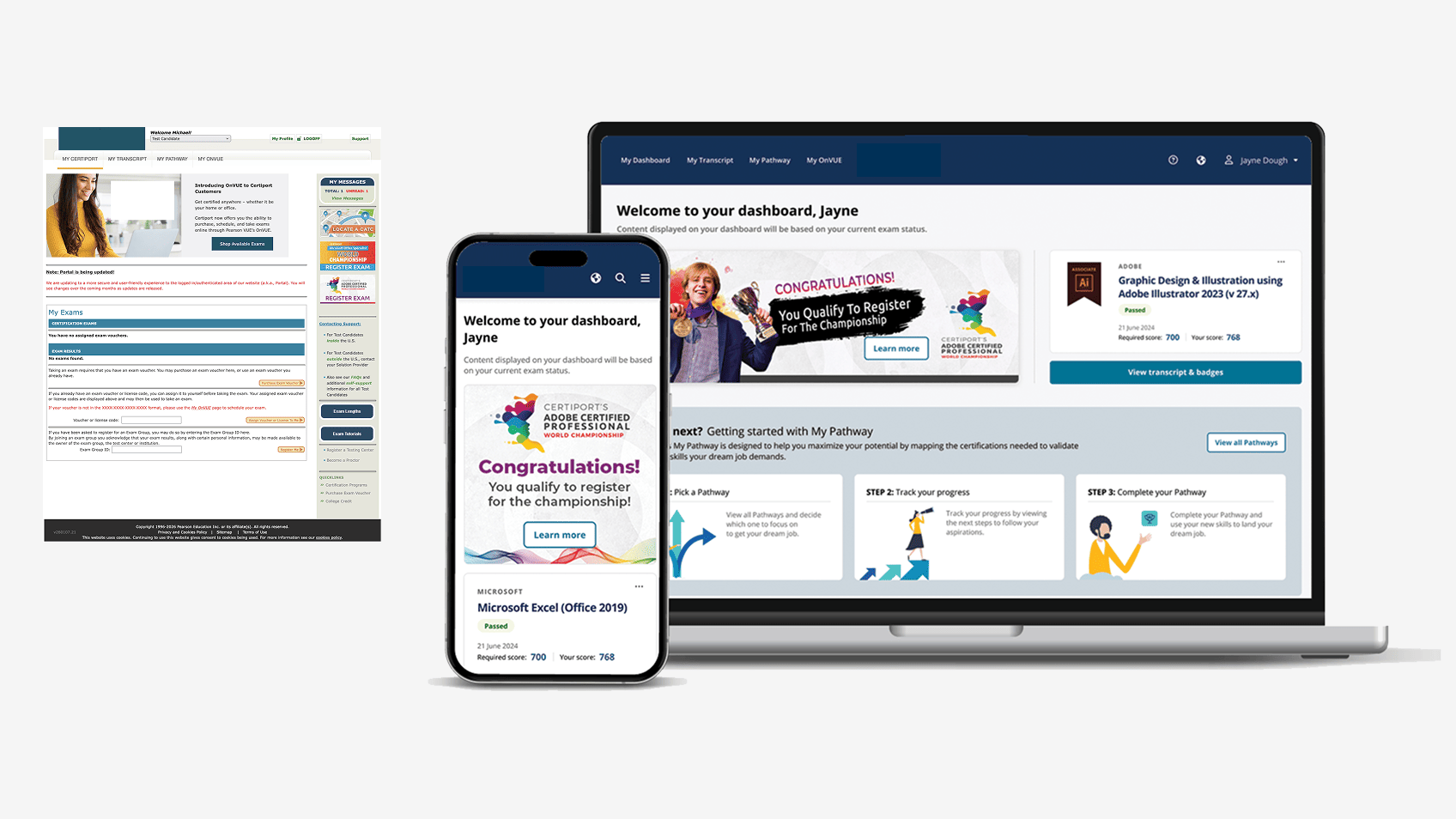
Legacy certification portal context and goals.

Where the legacy portal broke down

Administrative IA, text-heavy content, and limited mobile reach were burying the candidate's next step.

The legacy portal had been built up additively over years. It worked, in the sense that candidates could complete the core flows - but it asked candidates to do too much of the navigation work themselves.

  • Cumbersome registration spread basic account creation across multiple steps, with no path to a 30-second onboard for a candidate clicking in from a school computer between class periods.
  • Text-heavy pages walled off the content that mattered most - a candidate looking for "what do I do next?" had to read paragraphs to find the answer.
  • Limited mobile accessibility on a portal whose youngest, most engaged audience increasingly arrived on a phone.
  • Low return visitor rate. Candidates would log in to take an exam, get a certificate, and never come back - the portal didn't give them a reason to.
  • Inadequate ed-tech integration. K-12 candidates already lived inside SSO providers like Google and Clever; the portal didn't meet them there.
  • Information architecture organized around administrative concepts rather than the candidate's actual journey from "I'm exploring a career" to "I earned a credential I can share."

None of these problems were unique to one page. They were systemic - which is why the redesign needed a sprint format that could re-anchor the team on a single, candidate-centered model before any pixels were drawn.

How I framed the sprint

Five days, fourteen people, one problem statement, six problem areas.

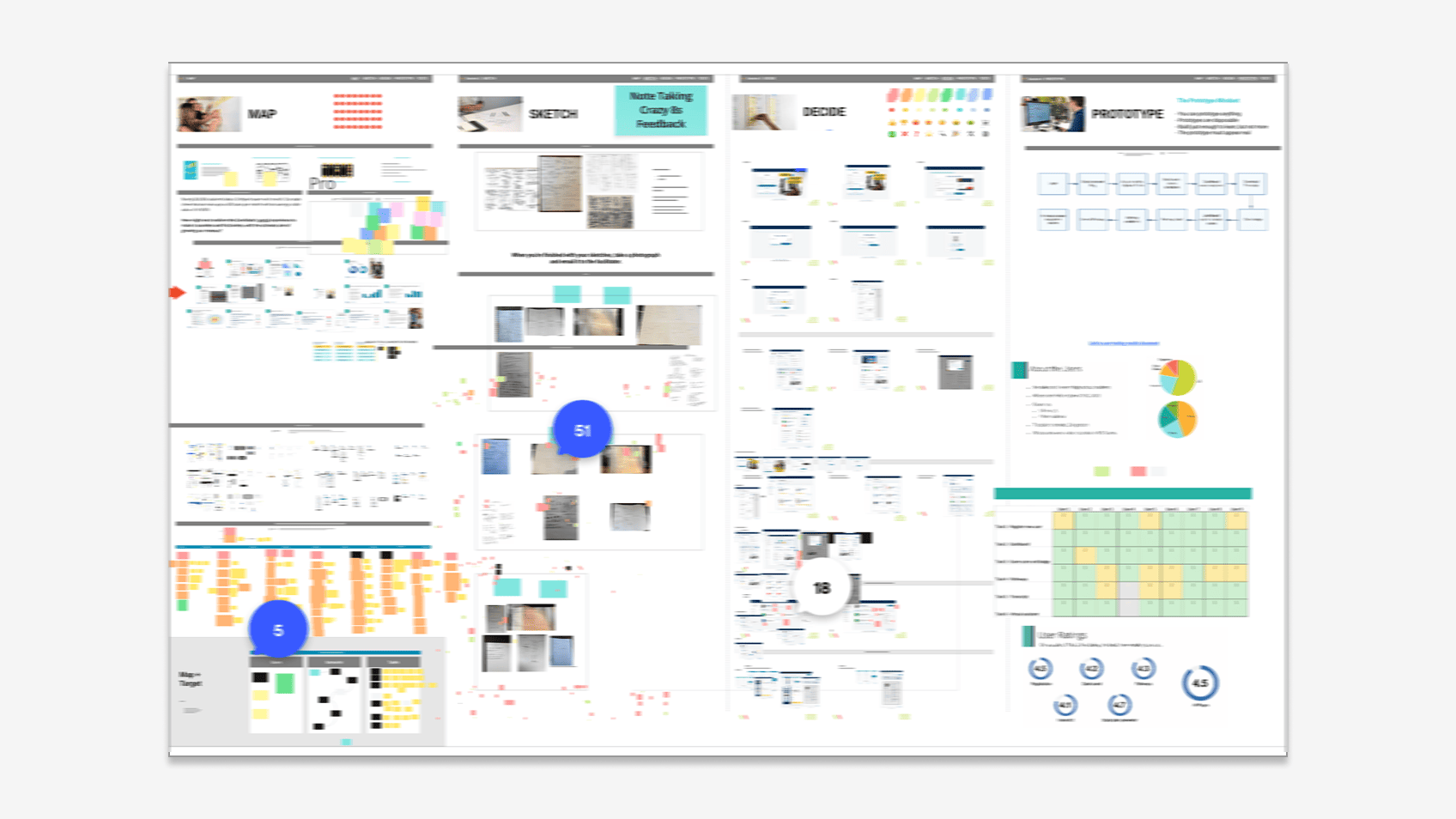
I structured the engagement around a Google Ventures-style five-day design sprint - Map → Sketch → Decide → Prototype → Test - bringing together fourteen cross-functional partners. The CX team contributed design and research. Product brought the roadmap. Engineering and Platform Architecture brought feasibility. Customer Support brought the ticket data. Marketing brought brand and acquisition context. International brought localization and ed-tech market reality.

Day 1 anchored the entire group on a single problem statement:

"How might we transform the candidate's portal experience to make it seamless and frictionless, with the ultimate aim of growing our revenue?"

From there, we segmented the portal into six problem areas so the work could move in parallel without losing coherence:

  • Account Creation - the path from a school computer or partner referral to an active candidate identity
  • My Profile - the data the candidate owns and the data the system needs to deliver a certificate
  • Dashboard - the answer to "what do I do next?" on every visit
  • My Pathways - multi-step routes from a starting point to a job-relevant credential
  • Support - the help layer for self-service and for human escalation
  • Badging - the moment of recognition that gave the experience its emotional payoff

This segmentation became the spine of the rest of the engagement.

Design sprint mapping, sketching, and decision artifacts.

From sketches to a tested prototype

Generative breadth, then converging fast on a buildable answer.

Day 2 was deliberately divergent. Every team member - not just designers - drafted Crazy 8s sketches across the six problem areas. The non-designers' sketches were as valuable as anyone's; engineers raised constraints, support reps surfaced ticket patterns, and marketing pushed on the candidate's emotional moment-of-truth. We ended the day with 20+ sketch sets containing more than 120 distinct ideas.

Day 3, the design team translated the strongest concepts into medium-fidelity wireframes covering the full candidate journey. The full sprint group reviewed every artifact with structured feedback: 18+ "what I like" comments, 22+ "what could improve" comments, and 30+ dot votes on top concepts. By end of day, we had alignment on the candidate journey shape and the patterns we'd carry forward.

Day 4, we built a functional prototype covering the highest-priority flows: registration, login, profile, dashboard, pathways detail, transcript, virtual assistant, and a personalized study plan. Day 5 went straight into usability testing.

Sprint output: medium-fidelity wireframes converging on the redesigned candidate experience.

What 9 candidates told us

A 9-candidate, multi-country qualitative study that pressure-tested every screen.

We ran usability sessions with 9 recent high school and early college students, ages 15 to 19, across five US participants and four international participants from Australia, Great Britain, and Singapore. Seven sessions were remote; two were in person. All were video-recorded for analysis. The sample was sized for qualitative depth, not statistical power - the goal was to interrogate mental models, not measure to a confidence interval.

The headline numeric ratings (1-5 scale):

  • Registration: 4.5
  • Dashboard: 4.2
  • Pathways: 4.3
  • Transcript: 4.1
  • Study plan generator: 4.7 - the highest-rated element in the study
  • Overall (all pages): 4.5

The qualitative findings validated the strategic bets:

  • Pathways landed. Candidates immediately understood the concept of a multi-step journey to a job role and rated it among their favorite features. One participant's exact words about the prototype: "I've got a 21-year-old brother who could use this site right now."
  • The virtual assistant outperformed expectations. Candidates told us the conversational help would have value by itself - even without exam booking - because it answered the questions they actually had ("Help me create a resume," "Recommend a certification").
  • The personalized study plan surfaced an unexpected use case - all participants said they'd want to share their plan with their teacher, a cross-account collaboration pattern that hadn't surfaced in earlier discovery.
  • "You did it!" celebration content was named as a favorite element by multiple candidates. Recognition mattered to this audience.

The pain points were just as actionable. The login screen still treated returning users as primary, so new users had to think before clicking "Join for Free." The transcript page lacked prominent access to printable transcripts and certificates - candidates expected those right there, not behind a dropdown. The pathways detail page had three competing call-to-action buttons that confused some candidates. Dashboard content varied enough across states that two participants thought they'd landed on a different page. One candidate wanted the study plan to be more flexible and customizable.

Each finding mapped directly to a refinement we could prioritize for the next sprint cycle.

Six decisions that shaped the redesign

From sprint outputs to a coherent candidate-centered system.

1. Frictionless registration around a 30-second goal. We trimmed required fields to the minimum, brought social and SSO sign-in (Google, Microsoft, Clever) up to equal visual weight with email/password, and gave "Join for Free" parity with "Log in" so new candidates didn't have to mentally rule out the wrong path before continuing.

2. Pathways as the spine of the experience. The most engaging concept in the prototype became the organizing metaphor. Each pathway ties together the steps from a starting point to a job-relevant credential, with progress indicators, potential earnings data, completion counts, and recommended preparation resources surfaced inline.

3. A virtual assistant that doubled as a help system and a study planner. Candidates rated this 4.7 / 5 and explicitly told us they wanted it more visible than its bottom-corner placement. We elevated it, gave it example queries to lower the activation barrier, and connected its outputs to a personalized week-by-week study plan candidates could check off as they progressed.

4. A consistent, role-aware dashboard. Every dashboard state shares a stable layout shell - "Welcome back, [Name]" anchor, next exam summary, exam checklist, current pathway - so candidates recognize the page across visits. Variable content lives inside that shell, not in place of it.

5. A transcript page rebuilt around the actual user task. The strongest pain point was that candidates expected to view, print, and share certificates and transcripts directly from the transcript page. We surfaced those as primary actions, added direct certificate previews inline, and deprioritized administrative concepts like "transcript access management" that confused first-time users.

6. Engaging visual moments at recognition points. The "Congratulations - you scored in the top 10% of candidates in your country" moment became a deliberately designed surface, not an afterthought. Bright colors, photography, and badge graphics were layered through pathways, transcripts, and profile to give the experience emotional pull at every recognition step.
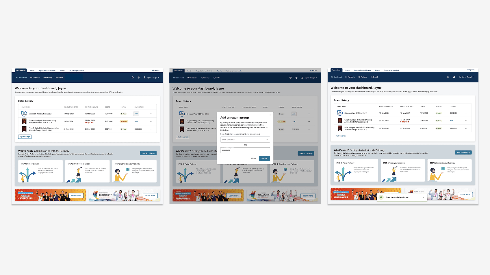
Six redesign decisions visualized: frictionless registration, pathways spine, virtual assistant, role-aware dashboard, transcript-centered tasks, recognition moments.

The path to development

Phased delivery negotiated with usability data, not optimism.

One of the hardest parts of any legacy modernization is the all-or-nothing temptation: hold the launch until every screen is perfect, and let candidates wait. The team adopted a different posture, captured in a metaphor that became the rallying line for the rollout: "We're letting candidates use the house as soon as it's built. Then we'll furnish it and finish the basement after they've moved in."

Phase 1 shipped the core flows that had tested at 4.1 or higher: registration, login, profile, the dashboard shell, and transcript essentials. Phase 2 layered on pathways depth, the virtual assistant, the study plan generator, badging refinements, and the recognition surfaces.

The phased approach was negotiated with engineering and product directly using the usability data. Findings rated 4.1+ across every tested area gave product leadership the confidence to ship the core experience rather than continuing to iterate in design. Lower-rated refinements - transcript task hierarchy, dashboard consistency, pathways CTA simplification - became the specific fixes for the next cycle, not blockers for launch.

Modernized portal screens across registration, dashboard, pathways, and transcript surfaces.

What I took from this

Modernization is a coordination problem more than a design problem.

The portal got better the moment fourteen people across six functions agreed on what "next step" meant for the candidate. Everything after that was execution.

A five-day sprint with the right people in the room produced more decision velocity than months of asynchronous review cycles ever did. The format forced trade-offs into the open. It collapsed weeks of debate about whether a pathway should be three buttons or one button into a single afternoon of dot voting in front of an actual user flow. And it gave engineering and product enough confidence in the direction that they were willing to commit to a phased delivery plan grounded in usability data rather than guesswork.

The other thing I took from this work: generative design moments matter even in enterprise B2B/B2C. The "Congratulations" celebration - the kind of recognition pattern that's often dismissed as unserious in enterprise software - scored as one of the most-loved elements in the entire study. Candidates wanted to be celebrated when they earned something. That's a reminder I've carried into every project since: the enterprise user is still a person, and the design contract still includes the moment of recognition, not just the moment of completion.

What I'd explore further if I returned to this work: longitudinal measurement of the 1.84 → 3.00 certifications-per-candidate goal once Phase 2 was fully in market, deeper instrumented integration with the SSO and ed-tech platforms students already live inside, and a tighter feedback loop between virtual assistant transcripts and the product roadmap - so the questions candidates actually ask shape what gets built next.

Outcomes
200K+
Monthly users on the portal
65%
Friction reduction in registration
4.5 / 5
Validated usability satisfaction