Modernizing Remote Exam Check-In for Global Credentialing
How a legacy 468×600 fixed-pixel desktop check-in app became a responsive cross-device experience for high-stakes credentialing - supporting 21 million annual exams across 180+ countries, with 300% user volume growth and a 25% reduction in check-in failure rates.
What was at stake
A check-in flow that has to work the first time, in any country, on any laptop.
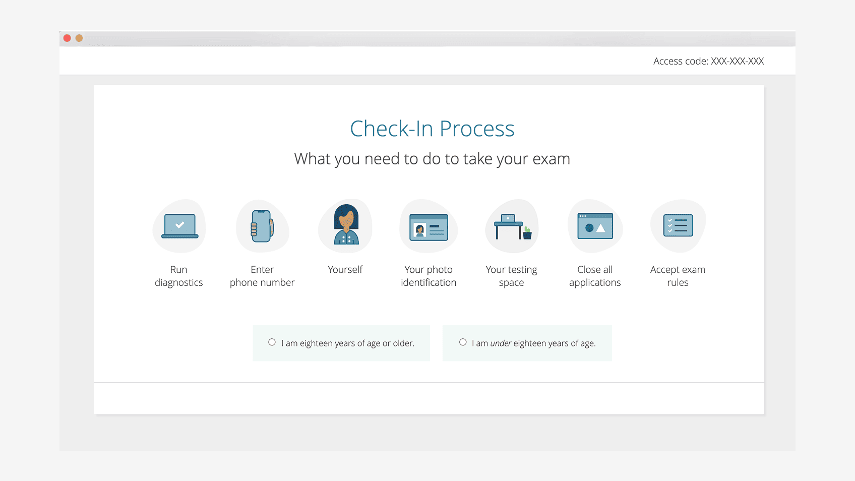
Remote proctoring lets candidates take high-stakes certification exams from their home or office. The check-in flow is the gate: identity capture, system check, workspace verification, photo ID, transition into a live proctored session. If it fails, the candidate either misses the exam window they paid for, or - worse - someone else takes the exam in their place.
The platform supports 21 million annual exams across 180+ countries, with 13 million+ proctored sessions per year. At that scale, a one percent failure rate on check-in is hundreds of thousands of candidates having a bad day.
I was the founding designer for the check-in experience and stewarded it through 5+ years of continuous iteration, including a global crisis-response modernization that compressed a 24-month roadmap into 6 months.

The legacy we inherited
A 468×600 fixed-pixel desktop app, acquired from a third party in 2016.
The check-in tool we started from was a legacy desktop application built in Flash, fixed at 468×600 pixels, originally acquired from a third-party vendor. It worked - it had been working - but it carried a decade of design debt:
- Fixed-pixel layout on a product that had to scale to a 4K external display and a 13-inch laptop alike.
- No mobile presence, even though candidates increasingly carried photo ID and exam vouchers on phones.
- Step-by-step rigidity that didn't survive contact with real-world variation: ID quality, lighting conditions, network speed, multi-monitor setups, accessibility needs.
- An aging tech foundation with deprecation deadlines closing in.
Every iteration cycle was hampered by the underlying constraints. Modernization wasn't a feature request - it was the only way forward.
Discovery and user reality
Candidates arriving stressed, on hardware we don't control.
Discovery surfaced three patterns we couldn't engineer away:
Candidates arrive stressed. They've studied for months and have a single-window appointment. Cognitive load tolerance is at a floor.
The hardware is theirs, not ours. Older laptops, low-bandwidth connections, mismatched cameras, locked-down work machines. The check-in flow has to degrade gracefully across all of it.
Photo ID lives on phones. A growing number of candidates didn't have a passport or driver's license sitting next to their laptop - they had it photographed on their phone. Forcing them to print or rescan was friction we owned.
That last finding became the seed for the Mobile Bridge.
How I framed the work
Trust-critical UX, designed to fail gracefully.
I framed the modernization around three commitments. First, the candidate's confidence is the system's UI. If the candidate hesitates, they're half a step from abandoning. Every state had to leave them visibly certain. Second, recovery is a first-class flow. Retry, switch device, switch ID, request greeter help - none of it could be buried. Third, design for the failure modes. The happy path is the easy work; the value is in the 5% of sessions where something is wrong, and the 95% of sessions that need the system to know the difference.
Bridging desktop and mobile
The Mobile Bridge: a candidate-led handoff that solved photo ID without breaking the desktop flow.
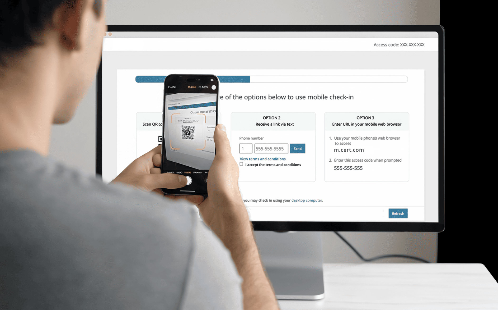
The single highest-leverage interaction decision was the Mobile Bridge: a flow that lets candidates pick up their phone mid-check-in to capture photo ID, then return to the desktop session without losing state. The bridge sends a QR code to the desktop, the candidate scans it on their phone, captures the ID with the higher-quality phone camera, and the image is delivered back to the desktop session.
It sounds simple. Designing it under the constraint set wasn't. The handoff had to be auditable for compliance. Session continuity had to survive a two-minute side trip on a separate device. The mobile capture screen had to work for someone on cellular, in poor lighting, holding a passport one-handed. And the entire path had to feel like one experience, not two.
Tradeoffs we made
Speed of capture vs. quality of evidence; security vs. friction.
Two tradeoffs ran through every screen.
Capture quality vs. capture speed. Higher-quality ID images mean higher first-pass acceptance, which means fewer escalations to a live greeter. But longer capture flows mean more candidates abandon. We chose to over-invest in real-time capture coaching (lighting, framing, glare prompts) so first-pass quality went up without the flow getting longer.
Security checks vs. candidate friction. Every additional security gate raises trust and lowers throughput. We made the security trade-offs explicit with operations and compliance, kept the gate count constant, and put the engineering work into making each gate fast and clear instead of stacking more of them.
What changed
5+ years of stewardship, plus a 24-month modernization compressed into 6.
Across 5+ years of continuous product stewardship, the check-in experience supported 300% user volume growth. During the global crisis when exam centers closed and remote proctoring volume surged, I helped compress a 24-month modernization roadmap into 6 months - a sustained sprint that reduced check-in failure rates by 25% through rapid iteration and tight cross-functional partnership with engineering, operations, and compliance.
The modernized check-in is now responsive, cross-device, and serving 21M+ annual exams across 180+ countries. The Mobile Bridge has become a reusable pattern across other capture flows on the platform.
What I took from this
Cross-device UX is not a feature - it's a posture.
The lesson I carry forward: candidates don't experience your platform; they experience the moment they're in. The Mobile Bridge worked because it stopped pretending the candidate's phone wasn't already part of the experience. Designing across devices isn't about responsive grids - it's about acknowledging where the user actually is and meeting them there.
The other thing I took from this: in a trust-critical platform at global scale, every percentage point of failure compounds across millions of sessions. Stewardship matters more than novelty - and small, sustained improvements layered over years are what compound into the durable wins.